Life deals a lot of cards. You ever play that card game as a kid, War? It’s simple and tedious and can take hours to finish. Just when it seems to end, the weight of the game completely changes and it can continue on for another hour.
I’ve been working on this map for a few weeks… in between buying a house, starting a new job, and having a child. Totally stress free, I might add.
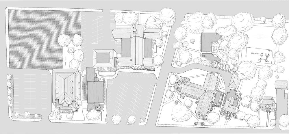
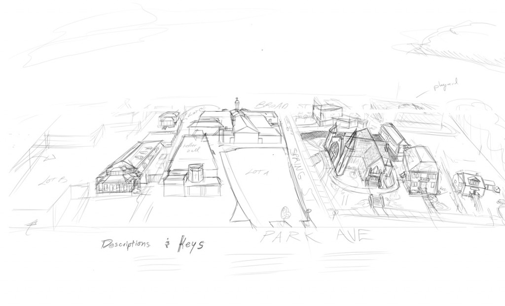
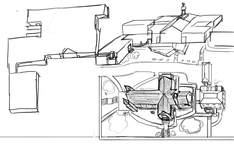
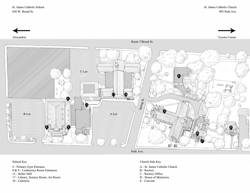
When I got the job to make a map, I knew I wanted to make it illustrative. The main motive being that I didn’t want something too bland. I also wanted to be able to show details of the building so that visitors could easily find specific marked entrances. So I went through a few drafts to figure out the best way to convey a clear picture of the grounds of a church and school, while also making it look as nice as possible. The first draft was mostly to figure out the best way to set up the perspective.
I decided on an isometric style of sorts and I’ve added a ton of detail to provide accuracy and points of reference. The picture is done (save maybe a few small edits) but the typography hasn’t been completed, as I’m waiting on the client to let me know what they want their font to be. But this is the mostly finished piece:
Let me know what you think!


