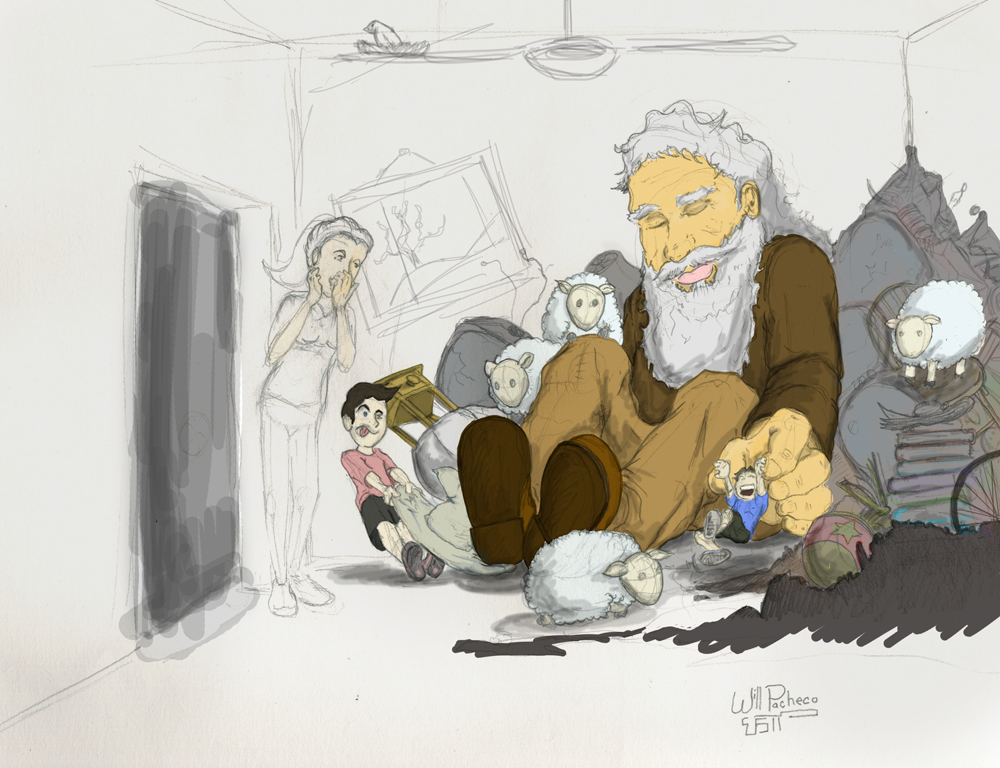
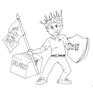
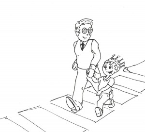
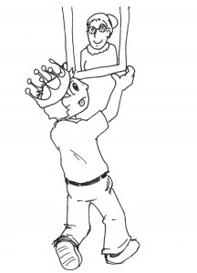
A few months ago, I started working for Pack-N-Move, a local business that helps the elderly transition or downsize from one residence to another. I began speaking to the owner about the project and during some email correspondence I accidentally sent her the above image that I was illustrating for another potential client. She loved the image so much that she asked me to give her entire brand an overhaul using the young boy character along with a new pamphlet and banner design for a convention she would be soon presenting at. I was flattered, so of course I said yes, despite the fact that I really don’t do graphic design and I’m not especially fond of print design either.
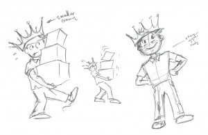
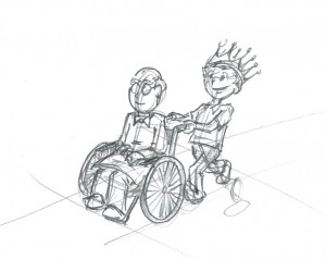
The first thing I had to do was really flesh out this character to represent the business and accurately express a narrative of the services provided. I did this by exploring what a character who worked for this company would do. How would he be? How would he act? What actions would he take to help an elderly customer base?
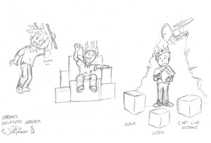
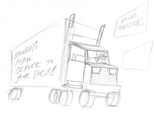
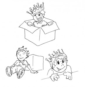
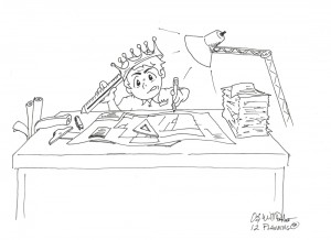
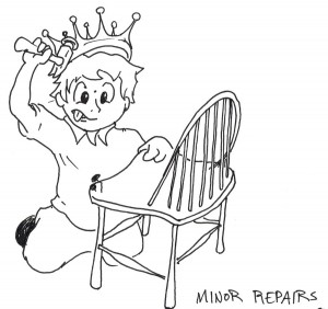
A lot of things came to mind for this stage of the process. Was he boy scout? Does he walk around outwardly helping people? Does he have fun while he performs his duties? I had to really ask myself what would define him as a character. The answer came very quickly though. This character was ‘the Selfless Helper.’ He loves to help people and he does so without wanting anything in return. Once I decided, through the power of illustration, what this little guy would do, I began to refine what he looked like and began drawing dozens of pictures that would tell the story of what the company does. Some of these images are below:
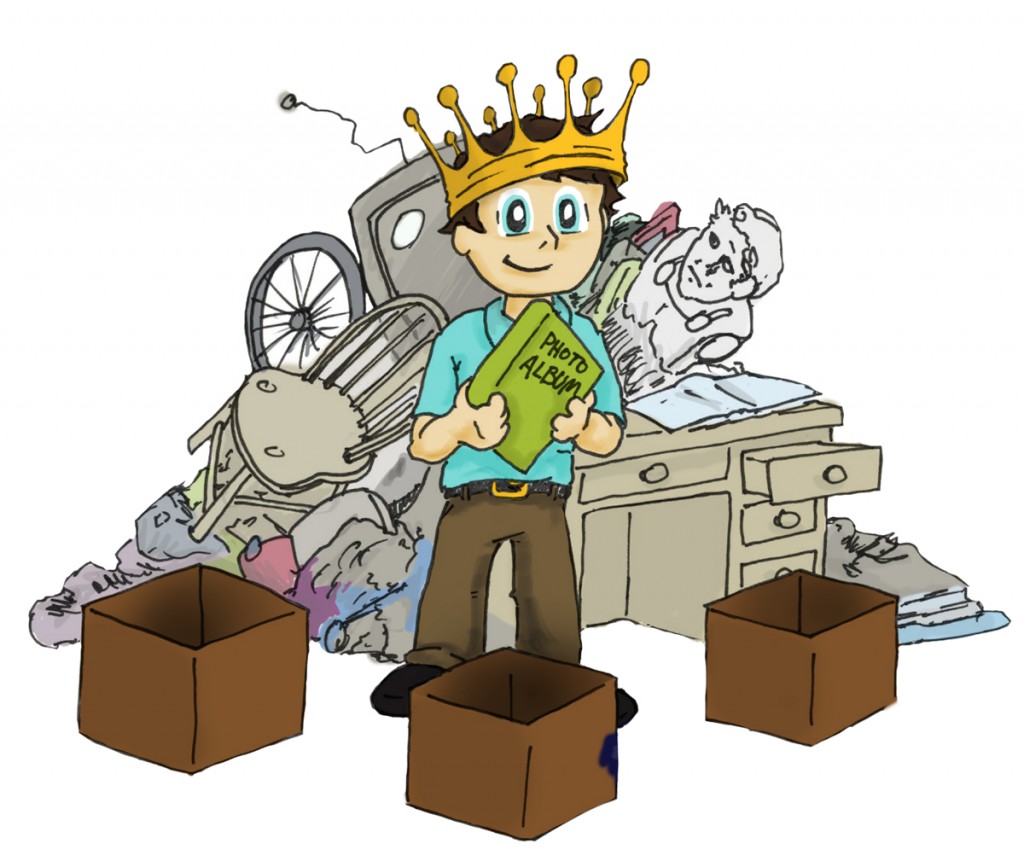
As you can see, some ideas popped back in, others were entirely scrapped, and some new ones came up during this time. All of these images were drawn by hand, scanned into my computer, and colored using Photoshop and my Wacom Bamboo tablet. At this point in the process, the client and I got together to go over the images and discussed the written content of the brochure. It was definitely the hardest part. There was a lot to tell about the company, but it became a game of what was relevant and what needed to be said in a 4-fold brochure. There was a lot of back and forth, and we literally went through upwards of a hundred different iterations all with very minor changes. I came up with an idea to condense all the content into a simple 3-step program. By working together and found something we were both happy with.
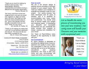
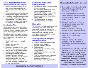
In the end, we turned her old brochure:
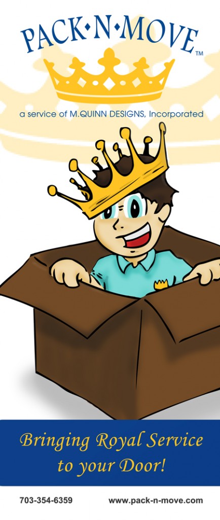
… into a 4-fold mail brochure:
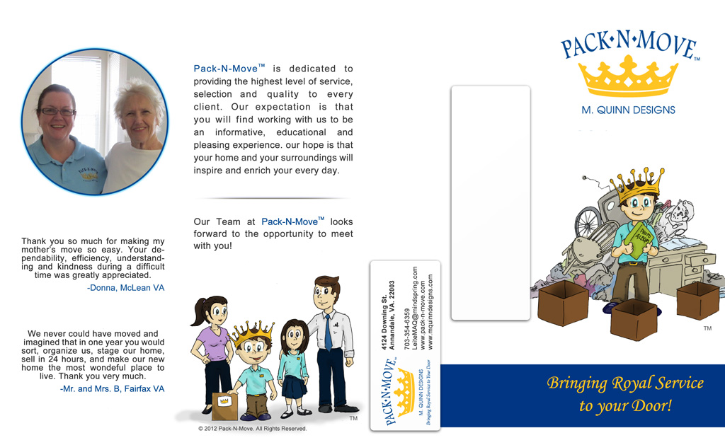
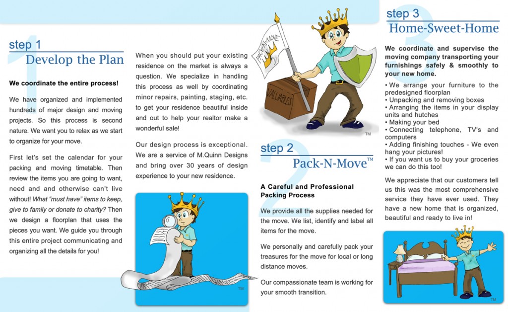
Complete with accompanying banner:
Back in March, Pack-N-Move showed off their newly designed pamphlets and banners at the convention, and I’m told it was a great success and that people really loved the new character. That’s all an artist wants to hear.

