Well, it’s been an interesting week for me. I started taking a database class biweekly a little over a month ago and last Friday I was assigned to learn OpenSuse Linux and install an Oracle server on it. According to Oracle’s documentation, this should be an easy task, however, I quickly found out that Linux systems cannot be learned by observing GUI differences. I knew this going in, but I discovered that I, perhaps, had overestimated my own abilities as well.
A little over a week later and I’ve thrown in the towel with the Oracle installation … for now. I fully intend on returning for a glorious conquest, but not until I’ve licked my wounds and scouted. So I downloaded Ubuntu and made a little dual boot Linux machine for myself. Now, from what I understand Ubuntu is for mainstream Linux users… which is perfect for me as it offers a transitional platform I was lacking when I tried to swim in the deep end with OpenSuse.
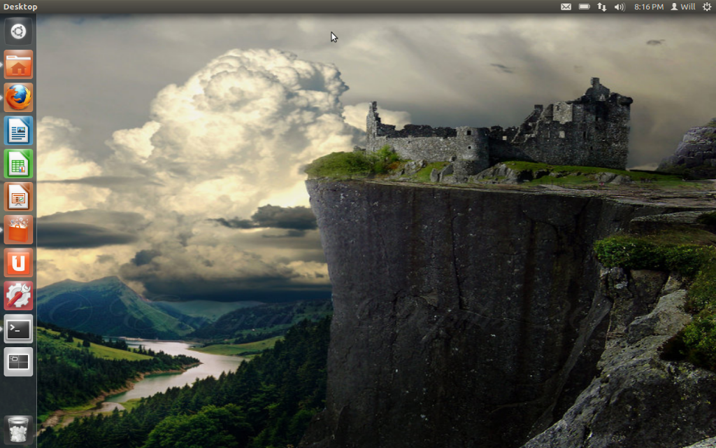
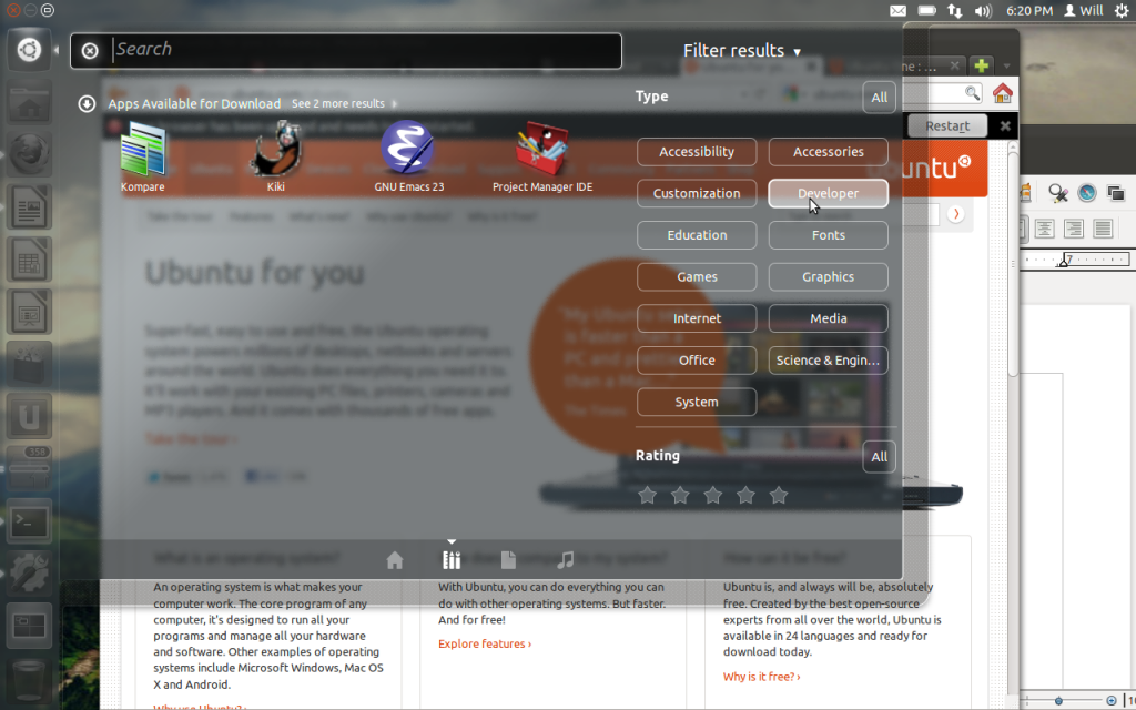
So while trying out Ubuntu and [successfully] installing and configuring my Apache server, I was struck by how well designed and unique the UI is. It looks a little bit like a Mac UI initially with a default top bar and dock. But the dock operates like a Windows taskbar with a bunch of dock apps in it… so a little bit like Windows 7. OpenSuse works similarly with the GNOME GUI, so I wonder if they’re related, but that’s not for now.
What IS for now is Ubuntu One. What a freaking sweet logo. Ubuntu One is a cloud service that Ubuntu conveniently includes in the Ubuntu installation. But who cares what they offer? Their logo (and website) are awesome. We’ve got the letter ‘U’ with the number ‘1’ overlayed on top. The cool implication, given by the number one is an upload arrow, which is a really nice touch for a cloud service.
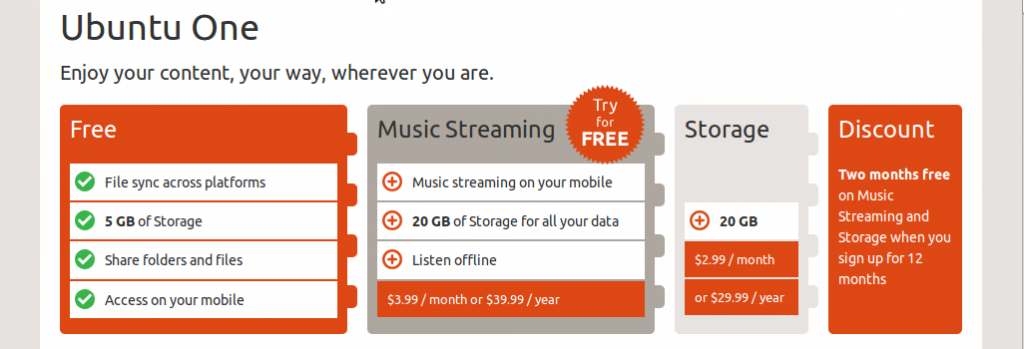
The rest of the website is similarly nice. Very clean, sharp and organized. My one complaint would be that maybe the header size is a little too big… however it is that size to display the logo. HMmmmm… Any way, check it out along with their services page, which I think includes an awesome infographic of services provided.
The moral of this tale is to branch out and not be afraid of trying new things… even new OS’s because you may find something cool, even if it doesn’t work out overall. “Thanks, Stan.”
That’s all for now. Honorable mention goes to the Call of Duty Elite website, which certainly isn’t new anymore but is nonetheless an impressively designed site. You really should check it out and even make an account so you can check out all of the different page layouts and such. TTFN.


