
Have you seen this load symbol?

I have. Maybe not in these specific colors, but layout. It’s everywhere lately. I think I first saw it on an iPod, then I saw it on my Google phone. I liked it when it first appeared. It was elegant, it was new, it fit the new wave of interesting tech products coming into the market. I know what you’re thinking. “Really? Who cares? Its a freaking animated logo or something for a load screen. People see it and whatever is loading comes up and the thing is gone. We see it for maybe three seconds tops.”
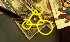
Well, person I made up for this blog post, you’re right. I am an incredibly nit picky person and for some God-forsaken reason I love things like animated logos and menu screens. I remember when I was a young kid I used to actually sit around in my room designing menu hierarchies and layouts for video games and dvds. I’m a total weirdo. This post is for the other weirdos out there, who, like me, design these things and notice strange things like the fact that the roulette wheel and ball loading graphic from Fallout: New Vegas is synchronized at three corners forming an equilateral triangle.
So for the sake of my insanity, bear with me. I fully understand that all load icons should have some consistency for the purpose of audience recognition. That being said, playing the best song of the year over and over on the radio tends to kill it. The same happens for good logos and graphics. So when the graphic-in-question showed up in Call of Duty: Black Ops, I was disappointed. It just means, to me, that this once nice little animation will likely start showing up everywhere where it doesn’t belong. It’s never bad to have something stock that fits the part, but I feel this logo belongs in the clean, static free, hipster-looking realm of iPods, phones, tech products, etc…. Certainly not in a gritty war game set in the Cold War era, where clean computer logos didn’t exist.
I don’t mean to pick on Black Ops. It’s just what I’ve seen most recently use the logo in a way that seems very much out of context to me. What do you think?