For those who are familiar, you may notice that I have redesigned my website. My goal was to blend my blog and portfolio together onto the same site, while also leaving room for further expansion later on down the road. By the same token, I didn’t want it to look like just another blog site with a stream of blog posts on the front page. I’m an artist, first and foremost, so an image feed seemed like the most practical thing to include.
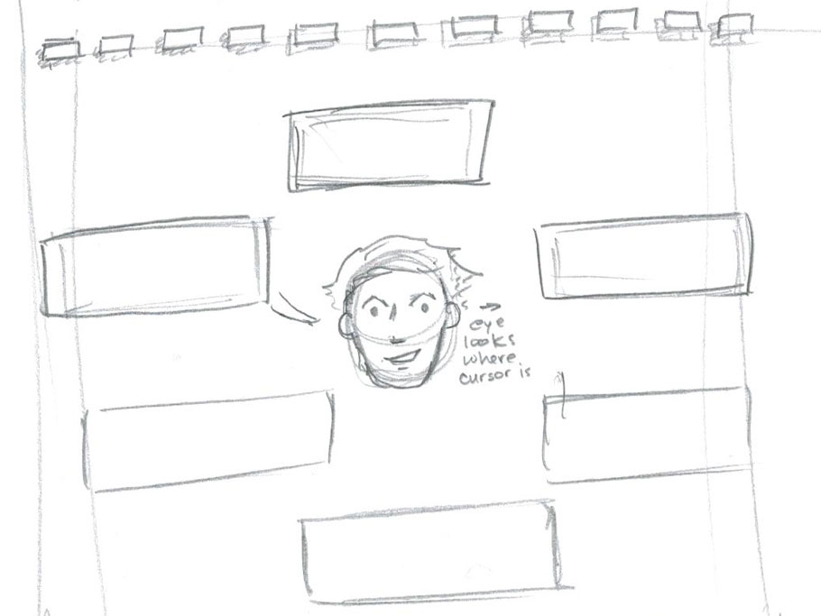
I set out to design a site using some skills I developed while working as an intern at Trinet Internet Solutions. I like to start with sketches, so the first thing I did was start drawing, even before I had a full idea of all the features I wanted my site to include. My first idea, is one that I actually really like, but don’t think would work for everything.
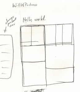
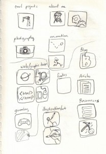
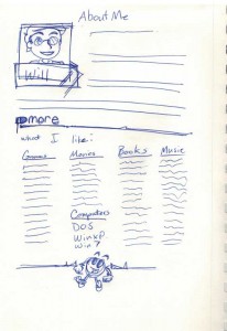
While, this idea got the cartoonish style that I enjoy, it didn’t seem easy to navigate for the web (maybe with a controller). So I set about refining the design and throwing out just about any idea that came to mind from icons to wireframes. These examples show to what extend I mixed and matched until I reached the final product.
After some thumbnails, I started to hone in on a specific idea and direction. I definitely wanted a clean, modern site, but also something with a bit of that cartoonish, sketchy look from the first picture.
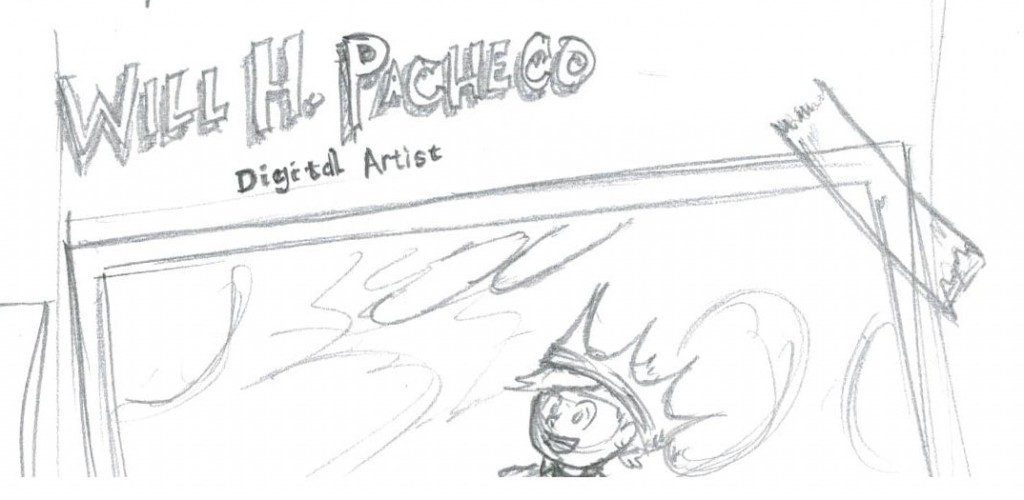
After choosing the design I liked, I started to draw a larger quick version of just the header to see what I thought. After still enjoying the idea of my name in cool sketchy lettering, I made a pass through Photoshop.
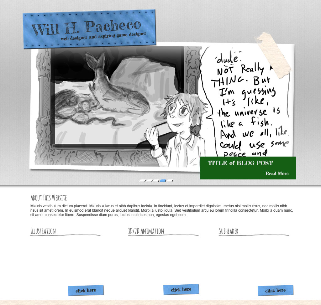
Looks kind of lame now, but it got me really excited about the redesign in general. Once I had a basic working site, I continued testing and testing it until I was happy with the navigation and the content areas. I decided to have a nice big and obvious welcome, as well as a larger space for the animation reel than originally planned for. I dropped the tape and the slant in the slider, mostly because it just didn’t look good in motion. The slant caused big problems in the way the picture slider rendered image animations. After some continued tweaking, the site evolved into what it is now.
I hope you like it as much as I do and please return as I plan to continue to evolve it and it’s features.

